This tutorial will teach you how to customize the the focus color and drop shadow in a Bootstrap form field. By default, a Bootstrap form field is blue with a drop shadow and looks like this when it is in focus:

Overall, this is a pretty clean modern look. However, it can look out of place if your site uses a different color palette or aesthetic vibe. For example, suppose you're using a green submit button via .btn-success:

Suddenly, the blue looks out of place. Moreover, the drop shadow on the input is not really consistent with the flat ...
Bootstrap is the most popular CSS framework on the web. It makes it incredibly easy to create beautiful, responsive designs that just work. However, it’s not always possible to use Bootstrap for your entire website. Often the website’s main CSS is outside of your control. You just need to use a portion of Bootstrap CSS. For example, at FormDen, we want all of our users to be able to use Bootstrap’s excellent form CSS even if they aren’t using Bootstrap on their website.
If you just add Bootstrap CSS to your webpage it will conflict with ...
Adding animation to an HTML form not only makes it looks slick but can help communicate to users when they've made a mistake. This tutorial will teach you how to create a Bootstrap Form and add animations to it.

View Demo Customize Demo Online Download Demo
To create our animated form, we'll need the following:
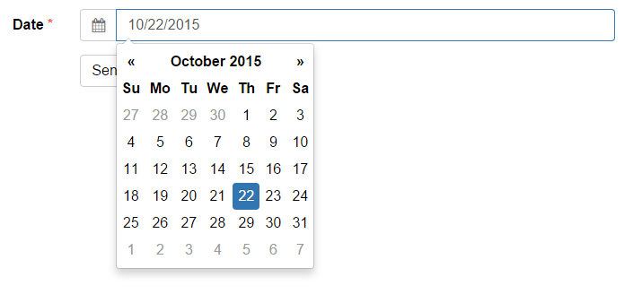
This tutorial will teach you how to add a date picker to your form using open source tools. A date picker is an interactive dropdown that makes it easy to choose the date from a calendar instead of typing it manually. It's a great way to avoid user errors because you can see the corresponding day of the week for each date. Plus it gives your form a little extra interactive shine!

We'll be using the Bootstrap-Datepicker plugin to handle all the dirty work. There are a number of ...
We’ve created a drag-and-drop bootstrap form builder. It allows you to easily create Bootstrap forms without having to manually write out a bunch of form syntax. When you are done, you can copy well-formatted HTML code from the builder:

and paste it into your webpage. If you are already using Bootstrap CSS on your website, the form will look great out of the box. If you don’t use Bootstrap on your website, that’s ok too. We’ve created an isolated version of Bootstrap CSS that you can wrap around your ...
Long forms are intimidating. An easy way to increase <form> conversions is by using conditional fields. Conditional fields are hidden by default and appear when they become relevant. They are a great way to make forms shorter and more personalized. For example, suppose you request customer feedback. Here is a demo with conditional fields, try it out:
Icons can be a great addition to your HTML form. Not only will they make your form look great, they'll help avoid user mistakes. Humans can recognize pictures (like an envelope) much more quickly than they can read words (like "Email").
To add icons to your form, you need to understand how to do 2 things:
A typical Bootstrap form field looks like this:
<div class="form-group">
	<label class="control-label" for="email">
		Email
	</label>
<input class="form-control" id="email ...© 2014-2020 Pareto Software, LLC | Blog | Bootstrap Form Builder