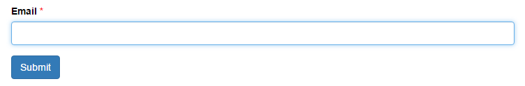
This tutorial will teach you how to customize the the focus color and drop shadow in a Bootstrap form field. By default, a Bootstrap form field is blue with a drop shadow and looks like this when it is in focus:
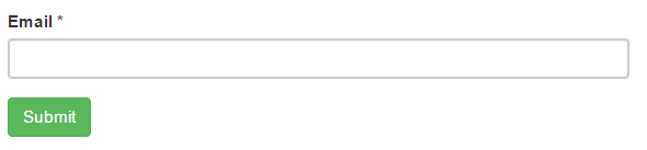
Overall, this is a pretty clean modern look. However, it can look out of place if your site uses a different color palette or aesthetic vibe. For example, suppose you're using a green submit button via .btn-success:
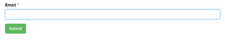
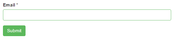
Suddenly, the blue looks out of place. Moreover, the drop shadow on the input is not really consistent with the flat button. It looks much better after we remove the drop shadow and change the <input> focus color to match the green in the submit button.
This can be done using our free Bootstrap form builder or by coding the CSS by hand. I'll demonstrate both approaches.
Fast and Easy Approach: Bootstrap Form Builder
You can create a form with custom focus color and shadow fields with our form builder by following these simple steps:
- Go to https://formden.com/form-builder/. You'll start with a default contact form. Customize the fields as you like.
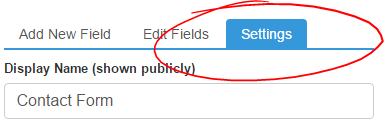
- Click on the Settings tab:
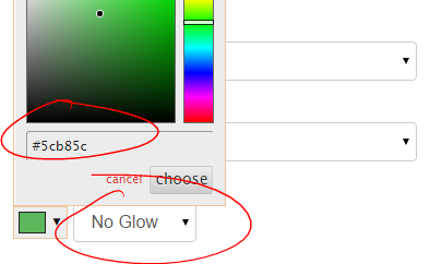
- Scroll down to the Input Focus Color and Glow setting
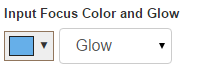
- Choose a color and glow preference:
- Click on the Preview Tab. All inputs will now have the new color and glow settings.
- Click on the Code Tab. CSS has been added to the page to overwrite the default the
<input>focus color and glow:
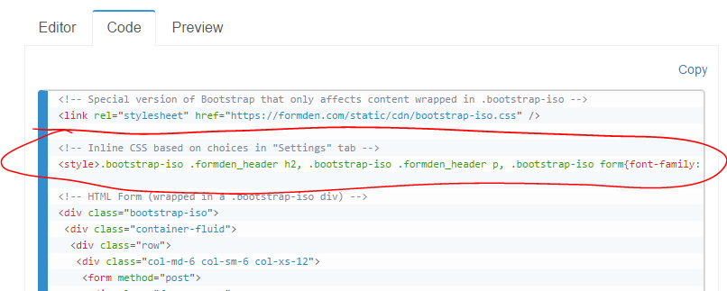 This CSS is designed to work with a form wrapped in a
 .bootstrap-isodiv. This is because the form builder uses an isolated version of Bootstrap that you can install on any website. - To embed the form you have created on your site, copy the HTML code and paste it into your webpage.
Under the Hood: How to Change the CSS
If you already have an existing form, you'll likely want to write the CSS by scratch. If you already are using Bootstrap 3 on your website, you simply need to add the following CSS to the <head> of your webpage:
<style>
.form-control:focus{border-color: #5cb85c;  box-shadow: none; -webkit-box-shadow: none;}
.has-error .form-control:focus{box-shadow: none; -webkit-box-shadow: none;}
</style>
If you are using our isolated version of Bootstrap and wrapping your form with a .bootstrap-iso div, you need to prefix all styles with .bootstrap-iso:
<style>
.bootstrap-iso .form-control:focus{border-color: #5cb85c;  box-shadow: none; -webkit-box-shadow: none;}
.bootstrap-iso .has-error .form-control:focus{box-shadow: none; -webkit-box-shadow: none;}
</style>
All form fields in Bootstrap 3 are controlled using the .form-control class. We want to alter the focus state. We change the border-color and remove the box shadow using box-shadow and -webkit-box-shadow (for older browsers).
When a field is validated (e.g. if you use FormDen processing), it's parent will be given the .has-error class. The default Bootstrap styling for .has-error .form-control:focus will now control the element. In the absence of our second line of CSS, the invalid field will look like this:
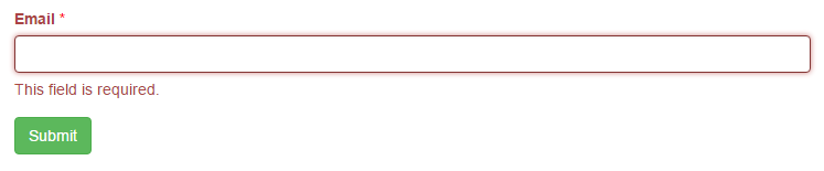
Notice how everything is now red and the drop shadow (or glow) is back!. The red is ok, because we want to communicate that the field is invalid/missing. However, we need to remove the drop shadow, which is what our second line of CSS accomplishes.
Changing Border Width and Color
So far, we've only changed the appearance of our form when a field is in focus. You can also change the initial border width and color. For example, to make a thicker gray border you'd simply use:
.form-control{border-width: 2px; border-color: grey;}
(if you're using Bootstrap CSS on your page)
.bootstrap-iso .form-control{border-width: 2px; border-color: grey;}
(if you're using our isolated version of Bootstrap)
Notice how this changes the width of fields in all states (not just in the focus state).
Video Tutorial
We've put together a short video that will walk you through this tutorial:
